Product Launch: Hatch Rest 2nd Gen
Art Direction / Photography / Marketing / Strategy
Hatch’s flagship product, Rest, was getting an upgrade. In an effort to move to a subscription based business, Rest 2nd Gen was positioned as everything the beloved Rest has plus new and improved features. In August of 2021, Hatch privately launched Rest 2nd Gen to existing Hatch users as a beta test. The team then used those learnings to not only improve the product, but improve how we market the product. In July of 2022 Hatch publicly launched Rest 2nd Gen.

Overview
Make Rest 2nd Gen as beloved as Rest
Hatch’s Rest Family of devices are built to help babies and kids build better bedtime routines and sleep habits. Hatch is launching Rest 2nd Gen with a campaign to connect the emotional benefits of using the product to the new brand promise we’ve aligned on: supporting unrested parents. This campaign should: connect Rest 2nd Gen launch to our brand positioning, establish alignment around messaging and positioning, and inform and inspire the work captured in the GTM plan.
Objective
Generate excitement and interest within our target audience for the launch of Rest 2nd Gen aligned around one core campaign message.
Key Results
Lift in site traffic
Lift in product page views
Increased conversion rate
Deliverables
Photography + video
Packaging
Product detail page + website updates
Email onboarding + launch email
Paid media
Organic social
Retail assets
Team
Creative Direction: Anh Dinh
Art Direction: Kelly Zerbe
Copywriting: Hannah Yeiser
Supporting design: Kathryn Pickett
Marketing: Erin Merani, Katie Wooten, Emily McGrath

Product Positioning
Rest helps babies and kids with their sleep, but really, Rest was designed for parents. It’s the bedside companion on your family’s sleep journey, built to inspire dreams for kids and give parents the tools to make everyone’s sleep a bit more magical.
Photography
With a large product launch comes a large photoshoot. With limited resources, the creative director and I had about 1 month to plan a photoshoot before the planned shoot dates. We decided to break out the shoot into 2 parts: a 1-day product lifestyle shoot and a 3-day lifestyle shoot with video. For the 1-day shoot, we produced it ourselves, and for the 3-day shoot, we hired a producer to help manage a much larger production. We sourced both locations in-house along with the prop stylist we hired for both shoots.

Art Direction
As Hatch is still a relatively young company, we didn’t yet have a solid photography style nailed down. For this product launch, we leaned into bringing out the “magic” of the devices, making sure it’s aspirational yet attainable, friendly and relatable, and being perfectly imperfect. We really wanted to make sure that our photo styles are realistic without being cluttered or messy to better resonate with our target audience: parents.

Overall the team was very happy with the results and they have proved to be amazing assets in the creative execution of the campaign. Below are a few of the final shots that were selected as hero images for the campaign.

Video
The video clips shot during the photoshoot were planned and intended to be used in short feature clips or as part of the larger launch video. While the creative director led the video direction, I stepped in during the editing phase while she was on maternity leave to bring this to the finish line. I worked closely with our videographer and product marketing manager to update the storyline, messaging, and overall lighting. I also worked closely with channel leads to get feature clips edited based on individual needs across paid social, retail, and the website.
Challenge: The video footage was shot a year before the public launch and the final editing. While we did not know that the timeline would be pushed out as much as it did, we had planned so well in the art direction phase that even with countless changes to the app experience, the footage was still very relevant to the product and feature stories we needed to tell.
Packaging
The Creative Director and I explored a packaging design system that was not only an evolution of our current product packaging, but could scale across the family of devices. The box structure was already established by our team in China based on the first generation product, so we came in during the artwork phase
Rest 2nd Gen needed to be able to sit on a retail shelf, so including key features and benefits was essential for the pre-purchase decision. Earlier in the year we had explored and established a more refined color palette for the brand, and during color testing for the packaging design, we landed on the current periwinkle. It was gender neutral enough to appeal to all parents. We also needed to design a quick start guide, a template that I established a year prior for some of our other products.


Website
For the website, we not only needed to create a new product page, there were a lot of smaller updates like the nav, footer, and family page that needed to be updated. Added challenge was that we were constantly testing on the site and some of the launch updates ran in tandem with those tests. I wireframed the new product page based on our PDP template that I worked to create, with the exception of some new modules. I collaborated with the E-commerce team, Product Marketing team, my Creative Director, and the web developer to concept, design, refine, and handoff.
For the initial private launch in August of 2021, we met our goal of units sold per week since we kept it small. For the public launch in July of 2022, we have been on target each week of sales and device registrations.
Rest 2nd Gen on hatch.co
(While the page is live, our team is currently migrating the site so some styles may not be accurate)

The most challenging part of the design process was that this product was fairly complicated compared to most of our other kids products, so deciding how to organize the page and what content to include was a lengthy conversation. We wanted to explain the product as much as we could but not make the page too long or have too much copy where the user wouldn’t read. Without a UX designer, these decisions were a collaboration between E-commerce, Product Marketing, and the Design team.


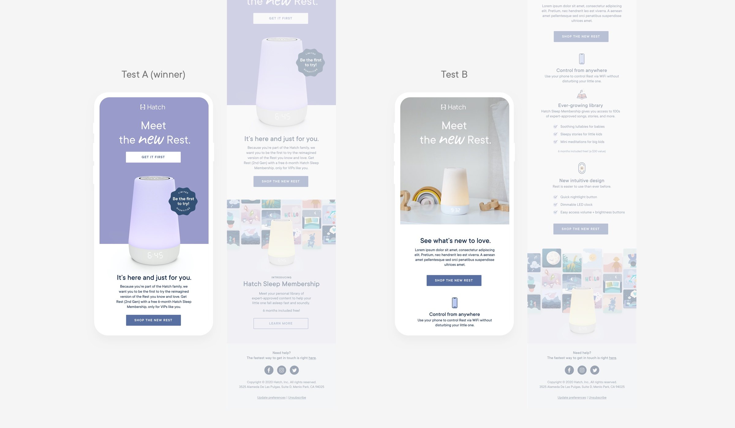
The lifecycle team broke out email into two parts: onboarding series and a launch email. The onboarding experience was high priority because it was not only one of the first post-purchase touch points, we needed to explain a somewhat complicated product.

We tested two launch emails, a shorter version and a more in depth version with feature and benefit details. After running for 2 weeks, Test A was the winner by a large percentage. I’ve learned in the past that launch emails perform better the shorter and more to the point they are, peaking interest with more direct messaging and making clicks to the site easier and more enticing.
Paid Social
When we privately launched Rest 2nd Gen, the creative team was leading the concepts and testing (prior to our VP of Growth starting a few months later). The initial set was all remarketing, targeting current Hatch customers or those familiar with the brand. We took learnings up until that point and designed based on performance. We did some message testing throughout the year between the private launch and public launch, and took a ton of learnings from our partner agency who started with us at the beginning of 2022. We introduced prospecting ads into the mix and are constantly testing and iterating on designs.
The private launch was designed by me, the public launch was designed by a freelance designer with our art direction.
